

Key Takeaways
Principles of Interior Design
The principles of interior design are a set of foundational guidelines - including balance, scale, rhythm, emphasis, and harmony - that govern how furniture, color, texture, and light work together in a room. They help explain why some spaces feel instantly comfortable and visually pleasing while others feel off. Understanding these principles gives any decorator a repeatable framework for making confident design decisions.
Design principles are distinct from design elements (line, shape, color, texture, space). Elements are the raw materials; principles are the rules for combining them effectively.
Why Design Principles Matter More Than Trends
Trends cycle through quickly, but the principles underlying good design have remained remarkably consistent across centuries and styles. When a room feels "off" but you can't pinpoint why, it's almost always because one or more of these foundational principles has been overlooked. Learning them gives you a diagnostic tool as much as a creative one.
These principles work across any aesthetic direction. Whether you're drawn to clean, spare interiors or richly layered ones, the same logic of balance and scale applies. For a deeper look at how these principles operate within specific aesthetics, see our guide to interior design styles.
“Design is not just what it looks like and feels like. Design is how it works.”
— Steve Jobs, Co-founder of Apple, frequently cited in discussions on design philosophy
Balance: Distributing Visual Weight
Balance is the sense that a room feels stable rather than lopsided. Every object carries visual weight - determined by its size, color, texture, and pattern - and balance is achieved when that weight is distributed in a way that feels intentional.
- Symmetrical balance mirrors objects on either side of a central axis. It feels formal and ordered - common in traditional dining rooms or entryways.
- Asymmetrical balance uses objects of different sizes and character to achieve equilibrium without identical repetition. It tends to feel more dynamic and casual.
- Radial balance arranges elements around a central point, like chairs circling a round dining table.
A practical test: photograph your room and look at the image. Visual imbalance that's hard to notice in person often becomes obvious in a flat image.
Use Painter's Tape Before You Commit
Before purchasing a rug, sofa, or large piece of furniture, use painter's tape on the floor to mark out its exact dimensions. Living with the outline for a day or two gives you a far more accurate sense of scale than measuring alone. It's one of the simplest ways to avoid costly proportion mistakes.
Scale, Proportion, Rhythm, and Emphasis
Scale and proportion govern how objects relate in size - to the room and to each other. An oversized sectional in a small living room creates a scale problem; a tiny rug under a large furniture grouping is a proportion problem. A commonly cited guideline suggests that a rug in a seating area should be large enough for the front legs of all major pieces to rest on it, which helps anchor the grouping visually.
Rhythm is repetition with intention. Repeating a color, shape, or material at measured intervals creates a visual beat that carries the eye around the room. Rhythm prevents spaces from feeling random without making them feel rigid. This might mean echoing the bronze of a light fixture in picture frames and cabinet hardware across the room.
Emphasis establishes a clear focal point - the element that commands attention first. Every room benefits from one dominant feature. Without emphasis, the eye wanders with no place to rest. With too many competing focal points, a room feels chaotic. Common focal points include fireplaces, statement art, a bold accent wall, or an architectural feature like a bay window.
68%
Homeowners who regret furniture purchases
According to a survey by Houzz, roughly two in three homeowners cite incorrect sizing as the primary reason they regret furniture purchases - a scale and proportion problem.
1-2-3
Rule of odd numbers in décor groupings
Interior designers widely use the 'rule of odds' - grouping objects in sets of one, two, or three - to create more visually engaging arrangements than even-numbered groupings.
60-30-10
Classic color distribution rule
The 60-30-10 rule - 60% dominant color, 30% secondary, 10% accent - is a longstanding guideline used by professional decorators to achieve color harmony in any room.
Harmony: Pulling It All Together
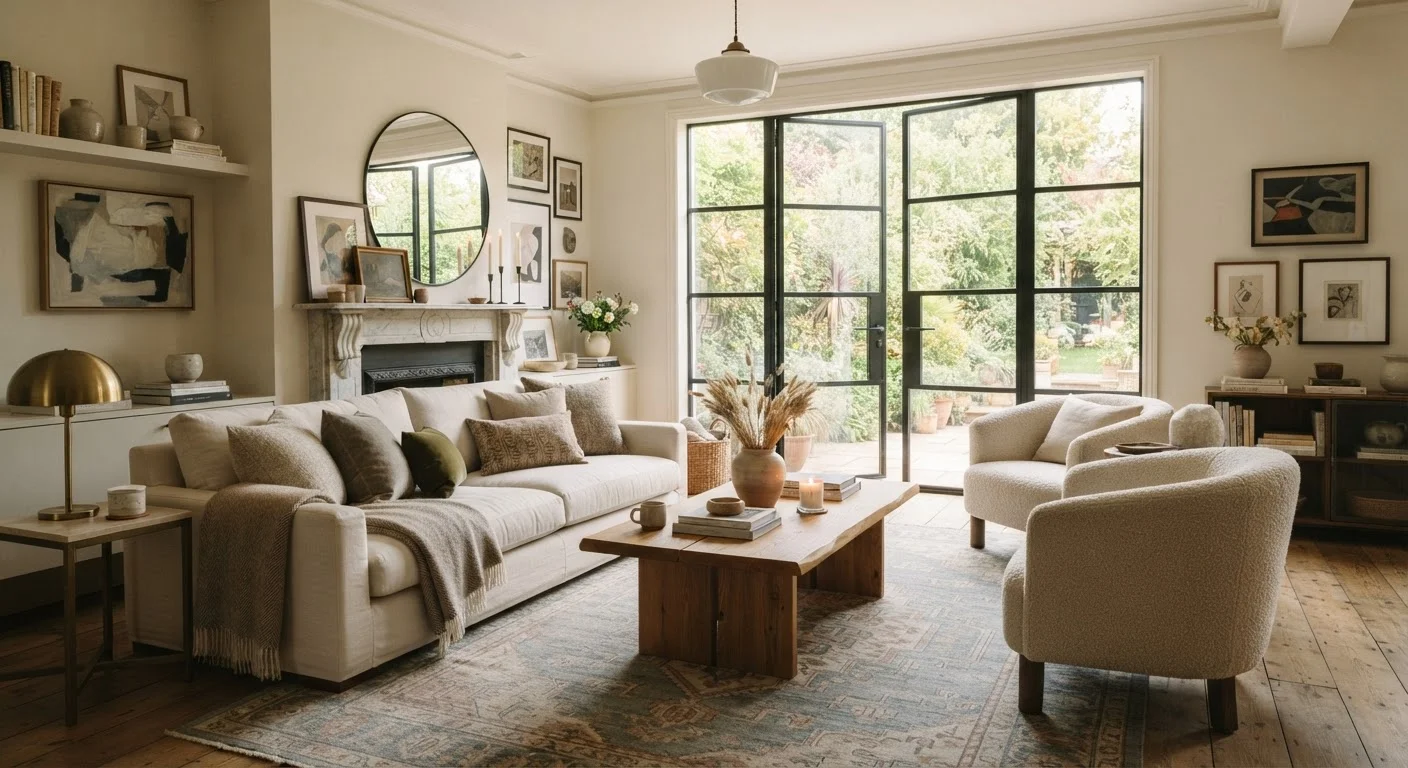
Harmony is the overarching principle that describes how well all the elements in a room work together. A harmonious space has a coherent story - the colors, textures, shapes, and materials feel like they belong in the same sentence. It doesn't mean everything matches, but it means everything relates.
One practical path to harmony is limiting your palette. Choosing two or three main colors (plus neutrals) and repeating them across soft furnishings, art, and accents ties a room together more effectively than coordinating every item individually.
Applying these principles consistently across your home is part of a broader approach to thoughtful household management. Our household management hub covers how intentional space organization supports daily life well beyond aesthetics.