

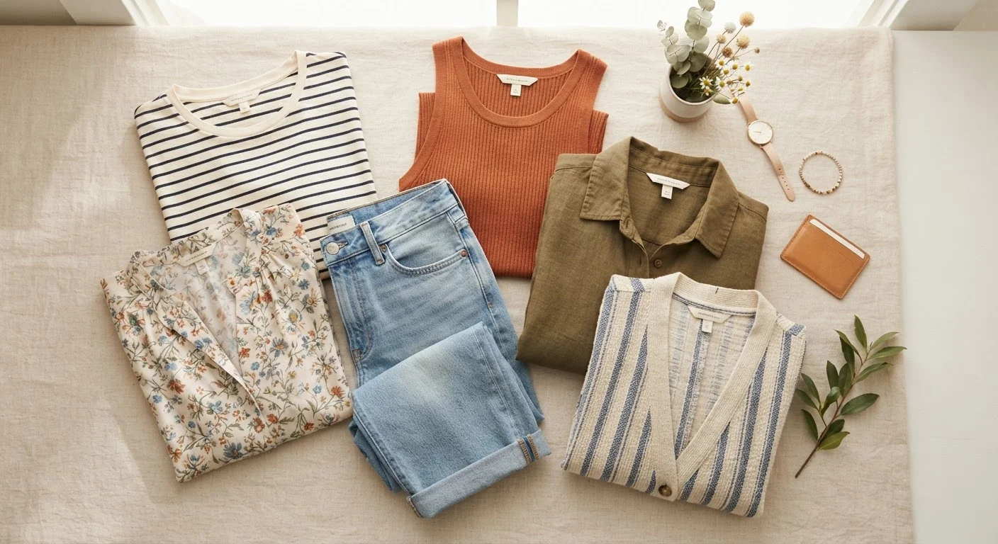
Key Takeaways
Why Pattern Mixing Feels Intimidating — And Why It Doesn't Have To
Most people steer clear of mixing patterns because it seems like a skill reserved for stylists or people who "just have an eye for it." In reality, pattern mixing follows a small set of repeatable principles — the same ones used in both fashion and interior design. Once you understand them, the guesswork mostly disappears.
If you're still building your baseline look, our guide to finding your personal style covers the fundamentals before you start layering complexity. And if you're also exploring pattern mixing in your home, the same core logic applies — mixing patterns in home décor uses scale rules and color anchors in exactly the same way.
Start With Two Patterns, Not Three
If you're newer to mixing prints, start with just two patterned pieces and build around them with solids and textures. It's much easier to calibrate one pairing at a time. Once the two-pattern combination feels comfortable, layering in a third becomes more intuitive and less overwhelming.
Below, we walk through the process step by step — no design background needed.
What You'll Need Before You Start
What you will need
Full-length mirror
Lets you assess how patterns and textures interact across your entire outfit from head to toe.
Neutral solid pieces (tees, trousers, blazers)
Act as visual rest stops between competing patterns so the eye isn't overwhelmed.
Phone camera
A photo can reveal clashing or overpowering patterns that you might not notice in person.
How to Mix Patterns and Textures Step by Step
Identify your anchor color
Before combining two patterned pieces, find the one color they share — even a subtle one. That shared hue becomes your visual anchor, the thread that makes the combination feel intentional rather than accidental.
For example, a navy-and-white stripe and a floral with navy petals read as a pair. The patterns are different in style and scale, but the navy connection ties them together.
Vary your pattern scale intentionally
Mixing patterns of the same size — two medium-scale florals, for instance — tends to feel chaotic because the eye can't decide where to settle. Instead, pair a large pattern with a smaller one. The contrast in scale creates a natural hierarchy that reads as deliberate.
Think: a wide windowpane check with a tiny polka dot. Or a bold oversized stripe with a delicate micro-print. The difference in proportion is what makes both patterns visible and coexist comfortably.
Add texture as a neutral pattern
Texture is pattern without print. A chunky cable-knit, a linen weave, a ribbed cotton — these all create visual interest the same way a stripe does, but without added color noise. Swapping one printed piece for a textured solid lets you keep depth while giving the eye a break.
A floral blouse over a ribbed-knit skirt, or a plaid shirt layered under a woven-texture vest, is a pairing that works because one layer adds print and the other adds dimension.
Insert a solid as a visual buffer
When two patterns feel like they're competing, a solid piece between them resets the visual tension. A solid belt, solid trousers, or a solid layer like a cardigan or jacket can separate two prints so each one gets breathing room to read clearly.
The solid doesn't have to be black or white — pulling one of the anchor colors into a solid piece actually strengthens the whole look.
Do a quick mirror (or camera) check
Step back and look at the outfit as a whole, or snap a quick photo. You're looking for one pattern to feel dominant, one or two to feel supportive, and at least one moment of visual rest. If everything is shouting at the same volume, something needs to go quieter — either swap to a solid, choose a smaller-scale version, or shift to a textured neutral.
This step takes 60 seconds but saves a lot of second-guessing once you're out the door.
Common Situations and How to Handle Them
Even with the principles in hand, a few scenarios trip people up consistently:
- "All my patterns feel too similar in scale." Try folding one piece so only a portion of the pattern shows — a smaller peek of a large print can read as a reduced-scale pattern without buying anything new.
- "I only own neutrals and one patterned piece." Introduce texture as your second "pattern." A woven, ribbed, or quilted neutral next to a single print creates the same layered effect.
- "I like the combination but it feels like too much." Reduce the number of pattern zones. If you have pattern on top, bottom, and accessory, drop one to a solid. Usually removing the accessory pattern is the easiest edit.
Clashing Undertones Are the Hidden Culprit
Two patterns can share the same color family but still clash if their undertones differ — a warm-toned rust stripe and a cool-toned burgundy floral, for instance. When combinations look "off" but you can't place why, undertone mismatch is often the reason. Trust your eye: if something reads as wrong in different lighting conditions, the undertones are likely fighting.
You Don't Need New Clothes for This
Pattern mixing is about proportion and color logic, not about owning more pieces. Most people already have patterned and solid items in their wardrobe that can be combined using these principles. Start with what you own before assuming you need anything new — the combinations are often already there.
These adjustments don't require a new wardrobe or a stylist — just a willingness to experiment with what's already hanging in your closet.