

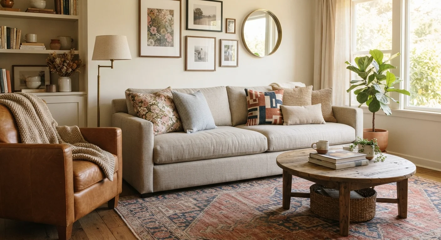
Key Takeaways
Why Pattern Mixing Feels Intimidating - and Why It Doesn't Have To
Most decorating mistakes with patterns come from one of two places: choosing prints that compete directly at the same scale, or mixing colors that have no shared thread. Neither problem is hard to solve once you understand what's actually happening visually. Pattern mixing is a skill built on a few repeatable rules, not innate talent. Designers use these principles consistently - and once you see them in action, they become second nature.
The goal isn't to match patterns. It's to relate them. Patterns relate through shared color, complementary scale, or belonging to the same visual family. Understanding those relationships is the foundation of confident decorating. For a deeper grounding in the underlying theory, interior design principles like scale, balance, and rhythm apply directly here.
The Core Rules for Mixing Patterns Successfully
Follow these practices and your combinations will read as intentional rather than accidental.
Vary pattern scale deliberately across every grouping.
When patterns compete at the same size, neither reads clearly and the combination looks accidental. Intentional scale contrast - large, medium, small - gives each pattern a distinct visual role and lets them coexist without fighting for attention.
Anchor all patterns to a shared two- or three-color palette.
Color is the primary tool that unifies otherwise unrelated prints. When every pattern in a room shares at least one common hue - even a secondary accent color - the eye reads the mix as a system rather than a collection of random choices.
Limit active patterns to three per room, then use solids and plain textures to rest the eye.
More than three competing prints in a single space tends to overwhelm rather than delight. Solids - whether on furniture, walls, or large textiles - act as visual pauses that make patterned pieces stand out more, not less.
Mix pattern families rather than doubling up within the same family.
Two florals or two stripes placed near each other create redundancy and unintentional competition. Mixing across families - one organic print, one geometric, one linear - creates visual interest through contrast while keeping the combination legible.
Distribute pattern placement around the room rather than clustering in one area.
Concentrating all patterned elements in one zone creates visual imbalance; the room feels heavy on one side and bare on the other. Spreading patterns - a rug here, pillows there, a wallpaper panel on the opposite wall - gives the space rhythm and harmony.
For a companion take on how these same ideas apply to fashion and outfit building, see mixing patterns and textures without the guesswork.
Color Is the Glue That Holds It Together
You can mix a bold stripe, a delicate floral, and a geometric - and have them feel like a single, purposeful decision - if they all share at least one anchor color. That shared hue creates an invisible thread the eye follows through the room. It doesn't need to be the dominant color in each print; even a secondary tone repeated across patterns creates cohesion.
The Two-Color Overlap Rule
When auditioning a new pattern, look for at least two colors it shares with something already in the room. One shared color is a coincidence; two is a relationship. This simple check prevents you from accidentally introducing a print that looks borrowed from a different room entirely.
Start by choosing your palette before choosing your patterns. If you're unsure where to begin, decorating with color when you're not sure where to start walks through building a room palette from scratch. Once your palette is set, audition patterns against it - not against each other.
Solids and plain textures matter here too. A linen sofa, a jute rug, or a painted wall gives patterned elements room to breathe. Rugs, curtains, and throw pillows can either amplify or ground a pattern scheme depending on how they're chosen.
Quick Wins: Start Small and Build Confidence
You don't need to redesign an entire room to practice these skills. The fastest way to build your eye is to introduce pattern mixing in low-stakes, easily reversible ways - throw pillows, a new table runner, a single patterned chair. Once you're comfortable, you can scale up. For rooms where space is already a constraint, pattern choices carry extra weight: decorating a small living room without making it feel cramped has specific guidance on keeping a compact room feeling open when adding visual texture.
Common Mistakes - and How to Catch Them Early
The most frequent misstep is scale collision: two large-scale prints placed side by side with no size contrast between them. The result is visual noise rather than complexity. The fix is always to introduce a smaller-scale pattern or a solid as a buffer.
The second common error is distributing patterns unevenly - loading one corner of a room with all the pattern while the rest stays bare. Patterns should be placed thoughtfully around a space so the room feels balanced. Think of it the same way you'd think about furniture arrangement: visual weight needs to be distributed. Furniture arrangement fundamentals offer a useful parallel for how balance works spatially.
Pattern Scale Is Relative to Room Size
A print that reads as 'medium' in a large open-plan living room may overwhelm a small bedroom or powder room. Always evaluate scale in the context of the actual space - hold fabric swatches or print samples against the wall in the room where they'll live before committing. What looks right in a showroom or on a screen may behave very differently in your specific space.
If you're working within a particular aesthetic - bohemian, mid-century modern, Scandinavian - patterns carry style-specific expectations. Interior design styles explained breaks down which pattern types read as native to each style.