

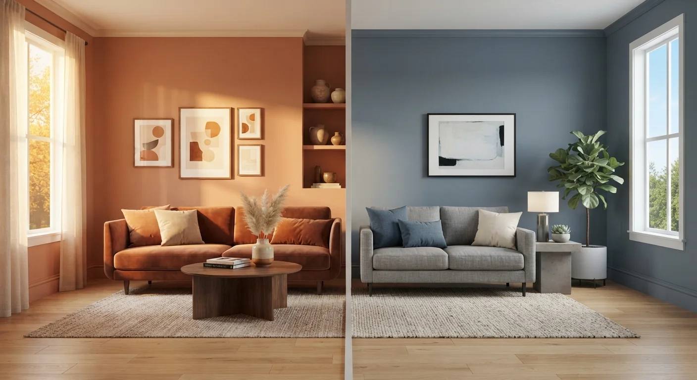
Key Takeaways
Option A
Warm Paint Colors
The inviting, energizing choice for intimate spaces.
Best for: Rooms where you want to encourage conversation, create coziness, or compensate for limited natural light.
Option B
Cool Paint Colors
The calming, spacious choice for airy environments.
Best for: Rooms where you want to promote relaxation, make a space feel larger, or balance strong afternoon sun.
If you want a living room that feels welcoming and encourages conversation
Warm Paint Colors
Warm tones like amber, terracotta, and soft red draw people together and create a sense of intimacy that works well in social spaces.
If you want a bedroom that promotes rest and mental calm
Cool Paint Colors
Cool hues such as soft blue, sage green, and muted lavender are associated with reduced stress and make it easier to wind down at night.
If you have a north-facing room with limited direct sunlight
Warm Paint Colors
Cool light from a north-facing window can make cool paint feel cold and flat; a warm tone compensates and keeps the room feeling livable.
If you have a small room you want to feel more open
Cool Paint Colors
Lighter cool shades visually push walls outward, giving a sense of expanded square footage without structural changes.
If you want a home office that balances focus and comfort
Cool Paint Colors
Muted cool greens and soft blues support concentration and reduce visual fatigue over long working hours.
How Color Temperature Works in Interior Spaces
Color temperature in paint isn't about heat - it's a visual property that describes whether a hue leans toward the red-yellow end of the color spectrum (warm) or the blue-green end (cool). This distinction has a measurable effect on how a room looks and feels, even before you add furniture or lighting.
Every paint color has an undertone that places it somewhere on this spectrum. A beige can lean peachy-warm or greenish-cool. A gray can feel almost lavender (cool) or nearly taupe (warm). Understanding undertones is arguably more important than the color itself - it's why two shades that look similar on a chip can feel completely different once they're on a wall. For a broader introduction to building a color palette from the ground up, see our guide on decorating with color when you're not sure where to start.
| Criterion | Warm Colors | Cool Colors |
|---|---|---|
| Visual effect on space | Makes rooms feel smaller, cozier | Makes rooms feel larger, more open |
| Psychological effect | Stimulating, social, energizing | Calming, restorative, focused |
| Best natural light pairing | North-facing, low-light rooms | South/west-facing, bright rooms |
| Ideal rooms | Living rooms, dining rooms, kitchens | Bedrooms, bathrooms, home offices |
| Risk to watch for | Can feel overwhelming at high saturation | Can feel cold in low-light settings |
| Undertone examples | Peach, golden yellow, brick red | Slate blue, sage green, lavender gray |
What Warm Colors Actually Do to a Room
Warm colors - reds, oranges, yellows, and their derivatives - are visually advancing hues. This means the eye perceives them as moving toward the viewer, which makes walls appear closer than they physically are. The practical result: a warm-painted room reads as more intimate and enveloping.
This quality is an asset in large, echoing spaces like open-plan living areas or formal dining rooms, where you want the room to feel gathered rather than cavernous. It also helps in north-facing rooms that receive cool, indirect light all day - a warm wall color compensates for what the light lacks.
~90%
Of first impressions influenced by color
Color researchers estimate that up to 90% of a person's initial judgment of a space is based on color alone, according to color psychology literature.
3-5°F
Perceived temperature difference by color
Studies in environmental psychology have found that people in rooms painted with warm colors perceive the temperature as several degrees warmer than in identically heated cool-colored rooms.
On the psychological side, warm tones tend to feel stimulating and social. Research in environmental psychology consistently suggests that red-adjacent hues increase arousal and energy levels, while yellow is linked to optimism. These are useful attributes in kitchens and living rooms, but can work against restful sleep in a bedroom.
One important caveat: very saturated warm colors can feel overwhelming in small doses. A deep, warm red applied to four walls of a small bathroom will likely feel oppressive rather than cozy. Use high saturation on a single accent wall or choose muted, earthy versions of warm hues for full-room application.
What Cool Colors Actually Do to a Room
Cool colors - blues, greens, purples, and their derivatives - are visually receding hues. The eye perceives them as moving away from the viewer, making walls appear farther than they are. This expands the perceived size of a room without moving a single wall.
That spatial quality makes cool tones particularly effective in small rooms, narrow hallways, and low-ceilinged spaces. A pale blue ceiling, for instance, can make a room feel taller than it is. Similarly, painting all four walls of a compact bedroom in a soft sage green can give the space a much more open, breathable feeling.
Cool colors also tend to feel calming and mentally restorative. Blues and blue-greens in particular are associated in research with lowered heart rate and reduced stress response, making them reliable choices for bedrooms, bathrooms, and home offices. If you're painting a workspace where you'll spend long hours, a cool, muted green or blue-gray tends to support sustained focus without visual fatigue.
The risk with cool colors comes in rooms with limited natural light or north-facing exposures. A cool blue or green can tip into feeling cold, clinical, or unwelcoming under low-temperature artificial light. Pairing a cool wall color with warm-toned lighting and wood furnishings is a practical way to balance this effect. Keep sheen level in mind too - paint sheen levels affect how much light a cool color reflects and how stark or soft it reads on the wall.
Testing Paint Before You Commit
Color temperature is notoriously difficult to predict from a paint chip alone. A small swatch under store lighting may look very different once applied in a large area under your home's specific light conditions. Most paint suppliers offer sample sizes specifically for this reason. Apply a roughly 12-by-12-inch test patch directly on your wall and observe it at different times of day - morning light, afternoon sun, and evening artificial light can each shift the reading significantly.
Matching Color Temperature to Each Room
There's no universal rule that any room must be warm or cool - but the room's function, size, and light exposure together create a practical framework for making that call.
- Living rooms: Either can work. Warm for cozy, intimate gatherings; cool for a calm, modern aesthetic with good natural light.
- Bedrooms: Cool tones are generally favored for their sleep-promoting qualities. If warmth is desired, reach for muted terracottas or warm greiges rather than saturated reds.
- Kitchens: Warm tones complement food tones and encourage appetite. Cool, clean whites and pale greens also work well when the kitchen receives strong afternoon light.
- Bathrooms: Cool blues and aquas reinforce a clean, spa-like feeling. Small bathrooms benefit from lighter cool shades that add spatial openness.
- Home offices: Muted cool greens and blue-grays support focus. Avoid high-saturation versions of either temperature extreme, which can become distracting.
- Hallways and entryways: These transitional spaces often benefit from warm, welcoming tones - or a bold accent that sets the mood for the rest of the home.
The finish you choose works in tandem with color temperature. Higher-sheen finishes amplify both warmth and coolness by increasing light reflection. You can read more about this interaction in our article on paint finish types and where each one belongs.