

Key Takeaways
Start here
Why Color Feels So Overwhelming (And Why It Doesn't Have to Be)
Learn the rules
The Basics of Color Theory for Home Décor
Build your foundation
Using Neutrals as Your Foundation
Add personality
Adding Accent Colors with Confidence
Avoid pitfalls
Common Mistakes and How to Avoid Them
Why Color Feels So Overwhelming (And Why It Doesn't Have to Be)
Standing in front of a paint display with hundreds of nearly identical swatches is a genuinely disorienting experience. Add the pressure of choosing something that will live on your walls for years, and it is easy to understand why so many people retreat to white or beige and call it done.
The good news is that color decisions become far more manageable once you have a framework. Rather than reacting to individual swatches in isolation, you can learn to think in systems - palettes, proportions, and relationships between colors. That shift from guessing to reasoning is what separates a room that feels intentional from one that just feels fine.
Before you pick up a swatch, it also helps to check your foundation. Understanding how design principles like scale and balance interact with color will give you a much clearer sense of what you are actually trying to achieve in a space.
The Basics of Color Theory for Home Décor
You do not need an art degree to use color theory practically. A few core concepts go a long way.
Complementary colors
Colors positioned directly opposite each other on the color wheel, such as blue and orange. When paired, they create strong contrast and visual energy.
Analogous colors
Colors that sit adjacent to each other on the color wheel, like green, teal, and blue. They naturally harmonize and create a calm, cohesive look.
Color temperature
A way of describing whether a color feels warm (reds, oranges, yellows) or cool (blues, greens, purples). Temperature affects mood and the perceived size of a room.
Saturation
How vivid or muted a color appears. Highly saturated colors are bright and intense; low-saturation versions of the same hue look dusty or muted.
Undertone
The subtle secondary hue beneath a paint or fabric color. For example, a beige may have pink, yellow, or green undertones that only become visible next to other colors.
60-30-10 rule
A decorating guideline suggesting 60% of a room uses a dominant color, 30% a secondary color, and 10% an accent. It creates visual balance without looking monotone.
The color wheel organizes hues into relationships. Colors directly across from each other are complementary - they create high contrast and visual energy when paired (think navy blue and warm amber). Colors sitting next to each other are analogous - they feel harmonious and calming together (sage green, olive, and soft yellow, for example).
Temperature matters enormously in interior spaces. Warm colors - reds, oranges, yellows - tend to feel energizing and can make a room feel smaller and cozier. Cool colors - blues, greens, purples - tend to feel calm and can make a room feel more spacious. For a deeper look at this dynamic, see our guide on how warm vs. cool paint colors affect a room.
Saturation - how vivid or muted a color is - also shapes mood. Highly saturated colors feel bold and modern; desaturated or dusty versions of the same hue feel relaxed and livable. Most successful residential palettes lean toward mid- to low-saturation ranges.
Building Your First Color Palette
A practical starting point is the 60-30-10 rule: allocate roughly 60% of the room's visual real estate to a dominant color, 30% to a secondary color, and 10% to an accent. This ratio creates variety without chaos.
Begin by identifying one color you genuinely love - not what you think you should like, but what you are drawn to. That becomes your anchor. Then build around it using the color wheel relationships described above. If your anchor is a warm terracotta, analogous choices (dusty rose, warm sand) will feel cohesive; a complementary choice (muted teal) will create pleasing contrast.
Collect physical references - fabric samples, magazine clippings, paint chips - and lay them together in natural light. Notice whether the combination feels harmonious or jarring. Your eye is more reliable than any algorithm once you give it something concrete to react to.
Start with Something You Already Own
A patterned rug, a favorite artwork, or even a throw pillow you love can serve as your palette source. Pull the two or three colors you see most in that piece and build your room palette from there. This is one of the most reliable ways to create a cohesive space without starting from a blank slate.
Using Neutrals as Your Foundation
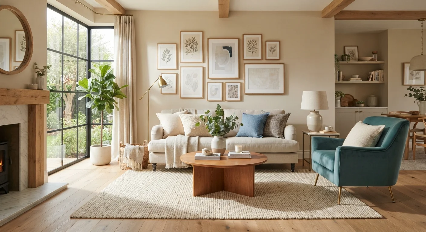
Neutrals are not a compromise - they are a tool. White, cream, gray, greige (gray-beige), and warm taupe give your eye a place to rest and allow other colors to register clearly. Without a neutral anchor, a room full of competing colors can feel visually exhausting.
One nuance beginners often miss: neutrals have undertones. A white with pink undertones will clash with cool gray furniture; a white with yellow undertones will feel warm and cohesive next to natural wood. Always evaluate a neutral against the other elements already in the room.
The most durable approach for first-time decorators is to use a neutral as the dominant 60% - walls, large sofa, or flooring - and introduce personality through the 30% and 10% layers. This makes the room easy to update over time: swap out pillows, throws, or art without repainting.
Lighting affects neutrals dramatically. A cool north-facing room can make warm greige look dingy; a south-facing room can make crisp white look yellowish. Our guide on layering ambient, task, and accent lighting explains how light quality shapes color perception throughout the day.
Adding Accent Colors with Confidence
Accent colors are where personality enters the room. Because they occupy only about 10% of the visual space, the stakes are low - and they are usually the easiest elements to change if you decide you want something different.
Effective accent placement follows a simple principle: repeat, don't scatter. If you introduce a rust orange in a throw pillow, echo it in a small piece of art or a ceramic vase nearby. Repetition of even a small color in two or three spots creates the impression of a deliberate palette rather than a random addition.
Textiles are the lowest-commitment way to test an accent color before committing to paint or larger purchases. A wool throw or a set of pillow covers let you live with a color for a few weeks and see how it actually feels in the space at different times of day.
Once you are ready to think about paint finishes for accent walls or trim, it is worth understanding how different sheens interact with color - our guide to paint finish types covers which finish suits which application.
Warm vs. Cool Paint Colors Guide
Learn how the temperature of a paint color affects perceived room size, mood, and natural light - and which tones work best room by room.
Paint Finish Types Reference
Understand the difference between matte, eggshell, satin, and gloss finishes and which finish is best suited to each room or surface in your home.
Interior Design Principles Overview
A foundational look at scale, balance, rhythm, and emphasis - the core principles professional decorators use that make color decisions easier and more intentional.
Common Mistakes and How to Avoid Them
Even with a good framework, a few common missteps trip up beginners.
- Choosing paint from a small chip. Colors look much more intense on walls than on a 2-inch swatch. Always test at full scale before committing.
- Ignoring existing fixed elements. Flooring, cabinetry, and permanent fixtures are part of your palette whether you account for them or not. Work with them, not around them.
- Matching too precisely. A room where everything matches exactly can feel flat. Slight variation in tone and texture within a palette adds depth.
- Overloading on accent colors. More than two accent colors in a single room usually competes for attention. Keep the 10% layer to one or two hues.
If you are decorating a compact space and wondering whether to go light or bold, our article on decorating myths designers disagree with challenges some common assumptions about color and room size. And once your palette is set, the next layer to tackle is pattern - see how to mix patterns without visual chaos to carry your design further.
Don't Rely on Screens to Judge Paint Color
Monitor and phone screens render color differently depending on brightness, settings, and color profiles. A blue that looks slate gray on your laptop may appear quite purple in person. Always evaluate paint colors using physical chips or large painted swatches in the actual room where they will be used, under both natural and artificial light.