

Key Takeaways
What Makes a Gallery Wall Look 'Off'
A gallery wall seems like a forgiving project - collect some frames, hang them up, done. Yet most first attempts end up feeling cluttered, lopsided, or strangely hollow. The problem is rarely about taste. It almost always comes down to a handful of structural decisions made without a clear framework.
The good news: every common gallery wall mistake has a straightforward fix. Understanding why things go wrong is half the battle. The same principles that make a room's furniture feel balanced - proportion, visual weight, and anchoring - apply directly to wall arrangements. If you've already been thinking about how your room comes together as a whole, our guide on furniture arrangement fundamentals offers useful grounding context.
Hanging frames too high on the wall, leaving them visually disconnected from the rest of the room.
Why it happens: Bare wall above eye level feels like wasted space, so people instinctively fill it. But the room's furniture and floor act as a visual anchor that artwork needs to connect with.
Inconsistent spacing between frames - some gaps are wide, others cramped - making the arrangement look unplanned.
Why it happens: Spacing is typically estimated by eye during installation, which introduces error that compounds across multiple frames.
Starting with the wall rather than planning the layout on the floor first.
Why it happens: Excitement to see the finished result pushes people to hang frames immediately, leading to numerous unnecessary nail holes and awkward compositions that are hard to undo.
Mixing too many different frame styles, finishes, and colors with no unifying element.
Why it happens: Variety feels creative and personal, and individual frames may each look great separately. But without a common thread, the combined effect reads as mismatched rather than curated.
Making the gallery too small for the wall, leaving large voids of empty space that make the arrangement look timid.
Why it happens: People underestimate the number of frames needed to fill a wall and stop adding pieces before the arrangement has enough visual mass.
How to Get It Right: Practical Corrections
Once you understand the typical failure points, fixing or preventing them is largely a matter of slowing down before you pick up the hammer. A few consistent habits make a significant difference in the final result.
57-60"
Standard gallery hang height from floor
Museums and interior designers commonly use this center-point height as a baseline for comfortable eye-level viewing in most residential spaces.
2-3"
Recommended consistent gap between frames
Design guidance from home décor professionals consistently cites this range as the sweet spot between frames feeling crowded and scattered.
Use paper templates. Trace each frame onto kraft paper or newspaper, cut them out, and arrange the templates on the wall using painter's tape. This lets you test spacing and composition without committing a single nail hole. Adjust until the layout feels right, then transfer the hanging hardware positions directly through the paper.
Set a consistent gap. Choose one spacing increment - typically 2 to 3 inches between frames - and stick to it throughout the arrangement. Use a tape measure every time rather than eyeballing. This single habit resolves the majority of spacing complaints.
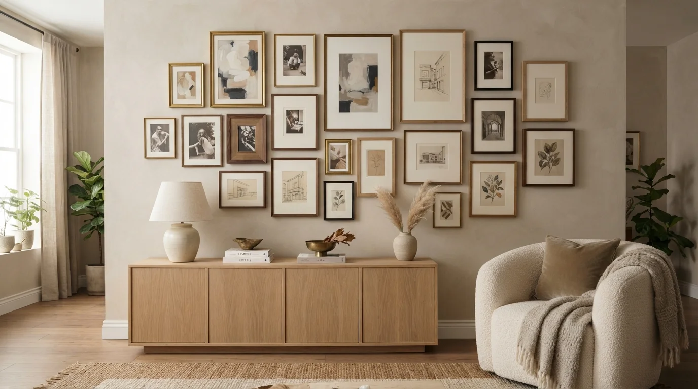
Anchor to furniture. Treat the piece of furniture below the gallery (a sofa, console, or bed) as the arrangement's foundation. The bottom edge of your lowest frame should sit roughly 8 to 10 inches above that surface. This creates a visual relationship between the wall art and the room rather than treating them as separate elements. The same logic applies when decorating smaller rooms - anchoring elements to furniture prevents things from feeling adrift.
Check Your Wall Before You Hang
Heavy frames - especially grouped arrangements - can add up to significant weight. Always locate wall studs or use appropriate drywall anchors rated for the combined weight of your frames. If you're unsure about anchor types or wall construction, consult a hardware professional before installation. Improperly anchored frames can fall and cause damage or injury.
Choose a unifying thread. Frames don't need to match, but they do need something in common - a consistent metal finish, a shared color family, or a uniform mat color. Similarly, mixing patterns in home décor works best when there's a color anchor tying disparate elements together. The same rule holds for gallery walls: diversity in frame style is charming; diversity in everything at once is chaotic.
Finally, plan for wall repair from the start. Even careful arrangements involve trial and error, and nail holes accumulate quickly. Knowing how to address them cleanly - covered in our overview of drywall repair without the guesswork - means you can iterate confidently without worrying about permanent damage.